
Visual content includes all visual materials whose purpose is to explain something quickly, attract attention or support sales. In practice, it is not just about attractive graphics, but about a deliberate choice of format for the goal, channel and audience. Visual content includes, among other things, photos, graphics, banners, carousels, infographics, presentations, short video, animations and visual elements on websites. The most important thing is that effective visual content shortens the time needed to understand the message and structures the communication where the user gives the content only a few seconds. That is why its value more often comes from usefulness than from aesthetics alone. If a piece of content is to fulfil its role, it should be clear, consistent with the brand and prepared for a specific publishing context.
What is visual content and what practical uses does it have?
Visual content is a set of visual materials created to communicate an offer more quickly, educate the audience, build recognition or support sales. It can take a static or moving form, depending on which decision it is meant to make easier for the user. In practice, it is not designed “for looks”, but for a clearly defined task.
The most common uses are very practical in nature. A graphic in social media is meant to stop attention and convey one idea. A carousel helps arrange several pieces of information in a logical order. An infographic simplifies data, and video can show a product, process or emotion that cannot be captured well by text alone.
In companies, visual content most often works as a process rather than a single file. It starts with a brief, meaning a more precise definition of the goal, target audience, channels and available materials. Then the format, information layout, visual style and technical publishing parameters are selected. Only at the end is the finished graphic, animation or video created, checked for readability, brand consistency and rights to use the assets.
Whether a given material works depends on the usage context. A different visual content works in a reach campaign, where a quick message and a strong first frame matter, and another on a product page, where the user needs specifics and fewer distractions. Yet another format will be appropriate in onboarding, where the key thing is to explain the process step by step.
The scope of work is also influenced by how many versions need to be prepared and how many channels the material is meant to reach. Available photos and footage, the need for a photo shoot or editing, the number of language versions and legal and licensing restrictions all matter. A common mistake is treating one project as a universal asset for all channels, even though each one has different requirements and a different way of being consumed.
- 01Faster communicationEducation, recognition, sales support.
- 02Static or movingUser decision, not appearance.
- 03Practical usesGrabbing attention, simplifying data.
- 04A process, not a fileBrief, clarifying the goal.
Key takeaway: Visual content is a set of tools designed for a specific goal, not just for aesthetics.
How do you create effective visual content in a mobile-first context?
Effective visual content in a mobile-first approach is prepared primarily with a phone screen, brief contact and immediate understanding in mind. In practice, this means a simpler layout, fewer elements in the frame and a clear hierarchy of information. The audience should immediately understand what they are seeing and what the next step is.
It is worth starting by determining where the material will be viewed. Social media favour vertical frames, short sequences and readability without zooming in. A landing page needs elements that display well on a smartphone, do not cover the content and do not increase load time. Designing for mobile-first means designing for real consumption conditions, not for a convenient preview on a large monitor.
Selecting the information remains crucial. One screen should carry one main idea rather than several equally important messages. When there is too much text, too many icons, numbers and decorative elements in a graphic or in the first few seconds of a video, the user will not read anything well enough. That is why it is often better to shorten the copy, enlarge the most important element and leave a clear focal point for the eye to settle on.
- Use a large, readable heading and limit the number of messages in a single frame.
- Design vertical or mobile proportions where the channel expects them.
- Check contrast, font size and CTA visibility on a phone, not only in the working file.
- Match thumbnails, the first seconds of video and safe margins to the requirements of the platform in question.
- Add subtitles to video and do not rely on sound alone for key content.
Technical channel fit also matters a great deal. Platforms impose specific proportions, length limits, compression methods and frame areas that may be obscured by the interface. If the asset does not take these conditions into account, important text may be cut off and the quality after publication may drop more than the source file suggests.
Accessibility cannot be overlooked either, because it directly affects usability. Clear typography, proper contrast, alternative image descriptions and subtitles for video are not an extra, but part of a well-prepared asset. If the audience has to guess the content, zoom in or struggle with a chaotic layout, visual content is not doing its job.
Finally, post-publication testing is needed. You need to check whether users stop on the asset, whether they scroll past it immediately, whether they click the CTA and whether they understand the message without additional explanation. In practice, the thumbnail, slide order, frame, editing pace or button placement are often adjusted, because even a good design needs fine-tuning to real audience behaviour.
What are the key stages of work on visual content?
The key stages of work on visual content include the brief, context analysis, format selection, production, channel optimisation, quality control and post-publication changes. In practice, this kind of framework organises decisions, so the asset is not only visually appealing, but above all delivers its intended purpose. Without a clear goal, even a well-designed asset will seem random. For this reason, the most important decisions are made before the graphic software is even launched.
- Brief and goal — you determine what the asset is meant to achieve: attract attention, explain the offer, collect leads, support sales or educate. At this stage, you also need to define the audience, publication channel, communication tone and required formats.
- Analysis of the usage context — you verify where and under what conditions the audience will see the asset. A reach ad is designed differently, carousel slides differently, and a graphic on a product page differently, where the user is looking for specific information.
- Analysis of assets and constraints — you assess the available photos, copy, data, brand book, fonts and rights to use the materials. This is the moment when it becomes clear whether typesetting and editing are enough, or whether new photos, recordings, illustrations or stock assets need to be purchased.
- Choosing the format and concept — you select the form best suited to the goal and arrange the information hierarchy. At this stage, a sketch, storyboard, slide layout or visual direction is created to guide the eye towards the most important message.
- Production and adaptation — you prepare the actual materials and variants of sizes, crops, subtitles, thumbnails and versions for different channels. In practice, this is the stage where readability is easily lost through too many elements or overly aggressive compression.
- Verification and implementation — you check text accuracy, brand consistency, export quality, licences and the full set of files. A well-built package should be ready for publication straight away, without manual polishing by the marketing team.
- Post-publication assessment — you analyse whether the asset was understandable, whether it held attention and whether it supported the intended goal. If not, the heading, frame, slide order, thumbnail, video pace or CTA visibility are most often adjusted.
The most common mistake is skipping the context analysis and going straight to design. As a result, the asset may look good in preview, but perform worse after publication, because the text turns out too small, the frame cuts off important elements and the message does not fit into a few seconds of user attention. The design should be assessed in the real place of use, especially on a phone.
In practice, the most time is saved by a systematic production approach. When a brand has defined CTA modules, a set of icon styles, slide layouts and rules for selecting and using images, further assets are produced more efficiently and maintain a consistent standard. This is especially important when many variants need to be prepared regularly for different platforms.
- 01Brief and analysisGoal, context, needs
- 02Format selection and contextChannel fit
- 03Production and optimisationExecution and parameters
- 04Quality control and changesTesting and iteration
Key decisions are made before graphic design begins, so that the asset fulfils a specific task.
What format decisions affect the effectiveness of visual content?
The effectiveness of visual content is determined above all by decisions about the type of material, proportions, length, information density in the frame and fit to the publication channel. These choices decide whether the audience will grasp the message immediately or scroll past it. The format is chosen for the task, not for aesthetic preferences. It is a simple rule that sets up most of the decisions that follow.
First, it is worth deciding whether a static, sequential or motion format will be better. A static graphic works best with one simple message. A carousel is useful when you need to show a sequence, several benefits or a short story. Video and animation gain the advantage when you need to demonstrate something, show a process, an emotion or a product in use.
No less important are the proportions and the framing approach. Today, most assets are designed with the phone screen in mind, so vertical or near-vertical layouts usually make better use of the available space than horizontal ones. You also need to take safe framing zones into account, because the platform interface can cover text, a logo or a CTA. The thumbnail and the first frame often decide whether the user will stop and look at the material at all.
Effectiveness can also be reduced by information that is too dense. If several messages, lots of numbers, small text and several focal points appear in one frame, the audience does not know where to start. It is usually better to spread the content across several screens or prepare separate assets than to try to cram everything at once. This is especially important in ads, graphics for social media and elements of a landing page.
The length of the asset and the pace of consumption also matter a great deal. Short-form content needs to get to the point as quickly as possible, while longer pieces should have a clear structure and a logical sequence. In the case of video, it is worth planning the first few seconds, captions and a clear message without sound, because many people watch content on mute.
Finally, there are technical and implementation issues. Platform compression can be ruthless to quality, a poorly chosen export can blur the typography, and the lack of language versions or test variants limits the usefulness of the material. A good format is one that remains legible after publication, quick to absorb and ready to drive a specific action.
What are the best practices for designing visual content?
Best practices for designing visual content start with a clear goal, a simple message and adapting the format to the specific publication context. The asset should work in real use, not just look good in the working file. The best visual content usually communicates one main thing, not five at once. This helps the audience grasp the meaning faster and know what the next step should be.
Building a clear information hierarchy works well. First the main message should stand out, then the supporting element, and finally the CTA or a detail. When everything is competing for attention, the user ends up not noticing what is really key.
The design is best checked first and foremost on a phone screen. What matters is the text size, contrast, safe margins and whether the message can be read without zooming in. If the material does not work in a small format, it usually does not work where the competition for attention is greatest either.
Effective visual content should take accessibility and usability into account. In practice, this means legible typography, sensible contrast, captions for video and avoiding overloading a single frame with information. This is not an aesthetic extra, but a factor that affects how the content is perceived and understood.
It is worth designing systemically rather than creating every asset from scratch. Fixed rules for using photos, icons, colours, CTA modules and layouts speed up production and reduce visual chaos. Templates are useful when they organise communication, not when they mechanically replicate the same layout without thinking about the goal.
It is also good practice to connect the design with the subsequent implementation. If the asset is meant to support sales, it is worth planning the CTA placement, consistency with the landing page, testing variants and the correct file naming for the publishing team straight away. Then visual content stops being a separate entity and starts genuinely contributing to results.
- 01Clear goal & one messageSimple communication of the main idea.
- 02Clear hierarchyMain message first.
- 03Mobile checkCheck on a phone screen.
- 04Practical use & CTAThe material works in real life.
Effective visual content communicates one main thing and is optimised for the real audience, especially on mobile.
How do you avoid common mistakes when creating visual content?
Common mistakes when creating visual content can be avoided by limiting the number of messages, testing the asset in the target channel and carrying out quality control before publication. Most problems do not result from a lack of aesthetics, but from a lack of decisions. When it is not clear who the asset is meant to speak to and what it is meant to achieve, the design quickly becomes a collection of coincidences.
The most common mistake is overloading the graphic with text and visual elements. The user then gets too many stimuli at once and does not know where to start. If you need to spend a long time explaining what can be seen in the graphic, it usually means that the graphic itself does not structure the message.
The second common mistake is the lack of a single focal point. Too many highlights, several headings with the same weight and random CTAs reduce readability. It is better to decide what should be noticed first and consistently subordinate the rest to that decision.
In practice, channel fit often fails too. An asset prepared without taking proportions, safe zones, the thumbnail, compression or the first few seconds of video into account may look good locally, but perform poorly after publication. The design has to be checked where the audience will really see it, not only on the designer’s monitor.
A common problem is also brand inconsistency and a lack of control over assets. Mixing conventions, random photos, different framing and inconsistent typography weaken recognition. On top of that comes legal risk if the licences for photos, fonts, music or illustrations have not been verified.
Many difficulties also arise at the production stage. A lack of versions for different channels, no captions, unclear file names, or no information on which format is for what make publishing harder and create more revisions. That is why, before handing over the materials, it is worth checking not only the appearance, but also the completeness of the implementation package.
How to measure and optimise the effectiveness of visual content after publication?
The effectiveness of visual content after publication is assessed through audience reactions, the way the material is consumed, and the impact on a specific business goal. A simple answer to the question of whether a graphic “looks good” is not enough, because aesthetics do not determine whether the material has fulfilled its function. First, you need to assign the material to a goal: reach, educational, sales or lead generation. Only then do you know which metrics are truly important and which merely look good in a report.
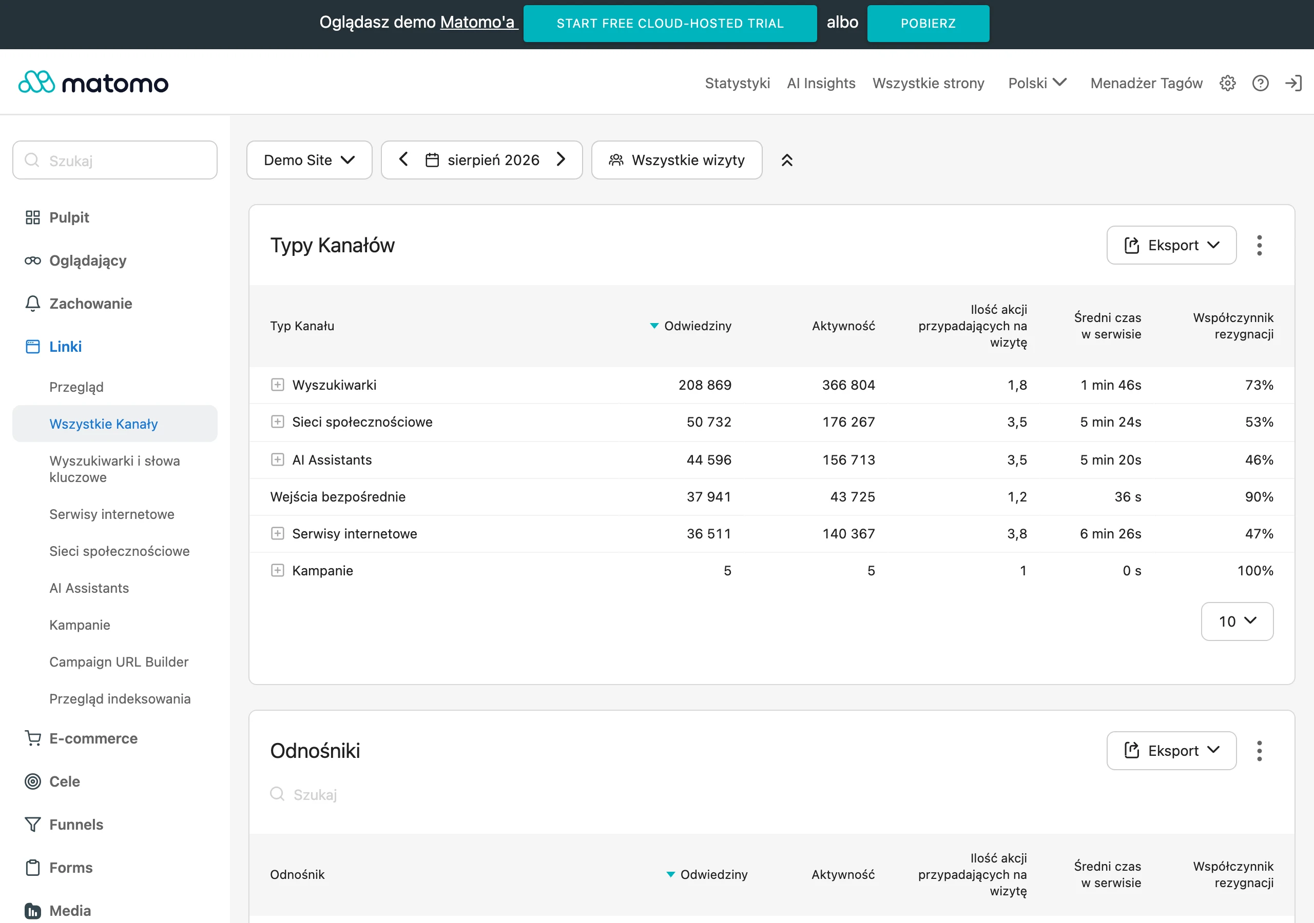
It is best to analyse performance in the context of the publication location and the stage of the user journey. The same format can play a different role in an ad, another on a product page, and yet another in email marketing or onboarding. Do not compare materials without aligning the conditions: channel, audience, budget, format and time of display. Otherwise, it is easy to draw the wrong conclusion that the creative is the problem, when in fact the targeting or placement has failed.
- If the material is meant to build attention, focus primarily on attention retention, viewing the first seconds, expands, carousel swipes and clicks on the thumbnail.
- If it is meant to explain the offer, monitor time spent with the material, transitions to subsequent sections, clicks on supporting elements and drop-offs on key slides or frames.
- If it is meant to support sales or lead generation, assess CTR, landing page visits, conversion rate, cost per result and the quality of traffic after the click.
- If the material works on the website, analyse scroll, section visibility, interactions with visual elements, and whether the user moves on rather than bouncing.
After publication, it is worth looking not only at the numbers, but also at the material itself in real conditions. Often the problem is not a flawed concept, but a weak thumbnail, text that is too small, a cropped frame, a barely visible CTA or an introduction that takes too long to get to the point. The fastest results usually come from replacing the first frame, headline, thumbnail, order of slides or the CTA placement. These are the elements that most strongly determine whether the user will start consuming the content at all.
Optimisation is best carried out iteratively and without unnecessary complexity. Change one key element at a time so that you can be sure what actually improved the result. In static materials, the headline, information layout, contrast and frame usually work best, while in video it is the first few seconds, editing pace, captions and end card. If you introduce several changes at once, you get a result, but lose the knowledge of what really worked.
Good analysis should end with an implementation decision, not just a report. If the material is underperforming, you need to decide whether to improve the creative, the fit for the channel, the offer, the CTA or the landing page. In practice, visual content works best when it is part of the whole process: it has correct labelling, test versions, clear file naming and data that can be linked to campaign performance or user behaviour. This makes subsequent publications faster, more consistent and easier to optimise.
FAQ
Frequently asked questions
What materials are included in visual content?
Visual content includes, among other things, photos, graphics, banners, carousels, infographics, presentations, short video, animations and visual elements on websites. What matters is not only how they look, but also what goal they are meant to achieve.
Why is visual content important in brand communication?
Because it shortens the time needed to understand the message and organises communication where the user spends only a few seconds on content. Its usefulness often matters more than aesthetics alone.
How do you create visual content for mobile-first?
You need to design it with a phone screen, brief contact and quick understanding in mind. A simple layout, a large heading, fewer messages and checking readability on a smartphone all help.
What are the key stages of working on visual content?
The process starts with a brief and defining the goal, then includes context analysis, format selection, production, channel optimisation, quality control and post-publication changes. This approach makes it easier to adapt the material to where it will be used.
Which format decisions most affect the effectiveness of visual content?
The most important factors are the type of material, proportions, length, information density in the frame and fit for the publication channel. One format works better for a single message, another for showing a process, several benefits or a product in use.
How do you avoid the most common mistakes when creating visual content?
You need to limit the number of messages, test the material in the target channel and carry out quality control before publication. Mistakes most often come from overloading content, lacking a single focal point and ignoring the usage context.