

Flat Design still works, although not in exactly the same form as it did a few years ago. Today it is no longer just about the fashion for “flatness”, but about designing an interface that can be scanned quickly and used comfortably. The user should immediately recognise where the content is, what the priority is and which elements are clickable. In 2026, the winner is not the most ascetic look, but the kind of minimalism that improves readability and does not make actions harder. This is especially important on mobile, in more complex landing pages and with forms. In practice, effective Flat Design more often works like a system for bringing order than as a purely visual aesthetic.
What Flat Design is in practice and how it affects the interface
In practice, Flat Design is an approach to interface design in which unnecessary embellishments are reduced, and hierarchy is built through layout, typography, colour and spacing. This direction is meant to make the screen easier to read and shorten the path to the key action. From a business perspective, this means fewer distractions and a simpler way of guiding the user to the CTA, offer or form.
In a well-designed Flat Design, the point is not to strip the project of depth entirely. The key is to control the number of stimuli and make sure the user does not have to guess what is active and what serves only a decorative function. If a button does not look like a button and a form field blends into the background, then minimalism stops helping.
On marketing websites, this style works best when clear presentation of the offer, fast loading and consistency across many sections matter. It is also easier to scale the project, because simple components are more predictable and easier to maintain within a design system. This becomes important when developing the site, running A/B tests and working on one product with several people.
Today the most common version is the extended one, namely a flat interface base supplemented with subtle shadows, outlines, layers and interaction states. Such accents do not take away from the simplicity, provided they are used sparingly and with a specific purpose. The best result comes not from “pure flat”, but from an interface that is visually simple and functionally unambiguous.
Current challenges and the context for using Flat Design in 2026
In 2026, the biggest challenge for Flat Design is not the look itself, but maintaining interface readability across different devices, in different modes and for different users. A flat style by itself still does not guarantee good usability. The outcome is determined by whether the user can see the hierarchy, recognise element states and understand what will happen after a click.
The biggest problems appear when design shifts too far towards simplification. “Pure flat” without contrast, without clearly defined buttons and without hover, focus or active states often reduces interface readability. Minimalism works only when it does not remove the signals needed for action.
Today, accessibility, responsiveness, readability on mobile devices and dark mode support matter more than the style itself. Low contrast, typography that is too thin and sections with almost identical layouts quickly add up to a screen that looks neat but can be uncomfortable to use. That is why hierarchy is now built not only through colour, but also through size, position, font weight and consistent spacing.
The brand character and the type of website matter as well. The more simplified the interface, the greater the need to give the design distinctiveness through typography, an accent colour, illustrations or its own visual tone. In content-heavy and sales-oriented websites, too consistent a minimalism can cut out buying arguments, context and trust elements, leaving the page looking modern but converting more weakly.
That is why in 2026 Flat Design is best treated as a framework that brings order, rather than a set of rigid aesthetic rules. Implemented well, it simplifies perception, speeds up navigation and makes it easier to develop the interface system. If a subtle shadow, outline or stronger component state needs to be added so that the user understands the screen better, that is a good design decision.
How to implement Flat Design effectively: key stages and decisions
Successful Flat Design implementation involves simplifying the interface without sacrificing readability, hierarchy and recognisability of clickable elements. At the start, it is worth checking where the user is meant to perform a specific action and what may make this harder. In practice, you do not design “flatness” for its own sake, but organise the screen around the most important goals. The good version of Flat Design in 2026 is a flat base supplemented with clear states, contrast and subtle interaction signals.
The first stage is an interface audit. You need to analyse the page layout, content density, points of transition to the CTA, forms, navigation and sections that look attractive but do not communicate function. This is the moment when problems typical of overly aggressive minimalism come to light: cards blending into the background, buttons that are hard to see and a lack of a clear reading order.
The second stage is deciding how “flat” the interface should be. If the website is simple and has few components, restrained typography, a well-set grid and a limited colour palette are often enough. However, if the page contains pricing, forms, dropdowns, modals or several types of CTA, additional cues are needed: outlines, gentle shadows, layers, hover, focus, active and post-action messages.
The next step is to organise the hierarchy. It is worth limiting the number of heading levels, establishing a consistent spacing scale and deciding what should dominate in each section: content, offer, form or button. Minimalism works only when the user can immediately see what matters most and what the next step is. Removing embellishments alone will not improve usability if the layout remains chaotic.
Next comes readability and component refinement. It is worth reviewing text contrast, line length, font sizes on mobile, the visibility of icons and the proportions between the heading, body copy and CTA. Buttons, input fields, alerts, cards and benefit sections should be refined separately, because these are exactly the elements that most quickly reveal whether flat design genuinely makes things easier or merely smooths over the visual layer.
At the final stage, testing and iteration after deployment are essential. You need to check whether the user immediately recognises clickable elements, understands the consequences of their actions, and does not lose their bearings between sections. If the interface looks modern but reduces form effectiveness or CTA visibility, it means the simplification has gone too far. The implementation should therefore cover not only the look, but also the system rules: colours, spacing, typography, component states, and versions for desktop, mobile and dark mode.
What to do and what to watch out for when designing a minimalist interface
When designing a minimalist interface, it is worth organising the layout, but you cannot remove the signals needed for action. The user should be able to recognise the button, form, active element and the result of the action taken without hesitation. The most common mistake is not that the design is too simple, but that it is too ambiguous.
The most sensible approach is to build minimalism as a system, rather than a series of individual visual decisions. A limited colour palette, a consistent spacing scale, predictable radii, repeatedly used components and coherent typography bring order without creating a sense of emptiness. This makes it possible to streamline the screen while still maintaining orientation in the content and consistency across the entire site.
In practice, a simple rule works well: where the user has to make a decision or interact, you can add a slight sense of depth. This applies especially to cards, sticky elements, modals, dropdown menus and priority CTAs. A subtle shadow or outline does not spoil minimalism if it improves understanding of the interface.
You also need to be careful not to base the entire hierarchy on colour alone. If two elements differ only in shade, it is easy to lose readability on a poorer screen, in dark mode or for people with visual impairments. A better result comes from combining colour with size, font weight, on-screen position and appropriate spacing.
- Ensure high contrast for text and interactive elements.
- Do not use fonts that are too thin, especially on mobile and against light backgrounds.
- Design clear hover, focus, active, loading and error states.
- Do not make all cards and blocks identical if they have different priorities.
- Do not reduce sales content to generic statements just so the design looks cleaner.
- Before implementation, define accessibility rules, mobile scenarios, dark mode and the way the design system will be updated.
This is particularly important on content-led and sales-focused sites. In such places, minimalism should organise information, buying arguments and trust-building elements, not cut them out. The best design decision is usually not “flatter”, but “clearer and more unambiguous”.
What mistakes to avoid when implementing Flat Design
When implementing Flat Design, first and foremost, it is worth avoiding simplifications that take away the user’s orientation and sense of what is actually interactive. The most common mistake is designing “flat” at any cost, without clear states for buttons, form fields, cards and navigation. If the user has to guess what can be clicked, minimalism stops working.
A second common problem is building the entire hierarchy using colour alone. In practice, colour should reinforce priorities, but it cannot be the only carrier of meaning. When a button, link and plain text differ only by a subtle shade, the recognition of interactions quickly deteriorates.
Another mistake is overzealous “weight loss” of the content. On sales and service pages, removing arguments, trust signals, descriptions or context often weakens the purchase decision, even if the layout looks cleaner. Minimalism should organise information, not reduce it to empty slogans.
Many problems also begin at the level of typography and contrast. Fonts that are too thin, text sizes that are too small, low contrast and cards that look almost identical make the interface seem modern, but harder to read. This is especially noticeable on mobile, in dark mode and in sections with a large amount of content.
A separate category of mistakes is the lack of component states in the real implementation. A design may look good in a mock-up, but if the code lacks hover, focus, active, disabled, loading or error messages, the user gets no feedback. In 2026, a flat interface without clear states is usually simply unfinished.
It is also risky to implement Flat Design without a system. When every button, spacing, corner radius and way of highlighting sections is created separately, the site quickly loses consistency. In practice, a limited palette, a fixed spacing scale, predictable components and clear rules for using accents work better.
You should also be careful about an overly generic brand look. The more simplified the interface is, the easier it is for it to end up looking “like everywhere else”. That is why distinctiveness needs to be built deliberately, through typography, illustration, framing style, accent colour or visual tone, but without harming readability.
How to measure the effectiveness and readability of minimalist design
The effectiveness and clarity of minimalist design are verified by whether the user understands the screen faster, completes the action more efficiently and makes fewer mistakes. Aesthetics alone are not a measure of success here. The key question is not “does it look modern”, but “does it guide the user to the goal without hesitation”.
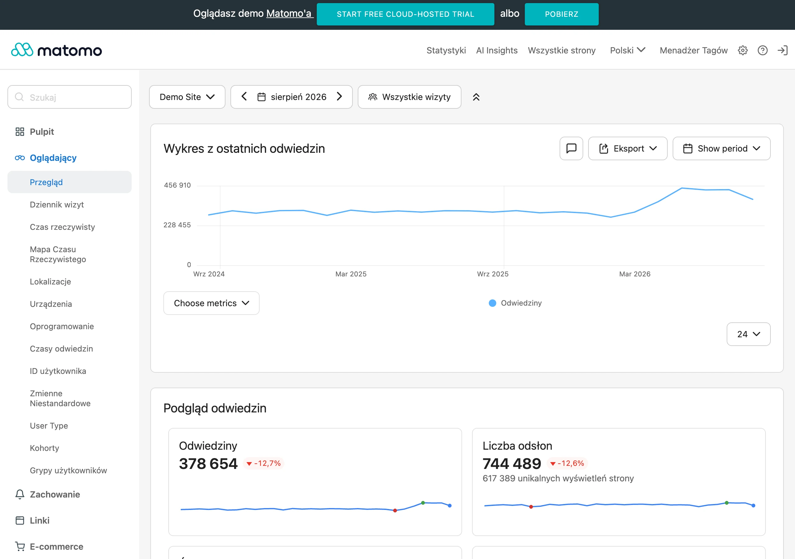
At the start, it is worth assigning specific goals to specific sections. For the hero, that will be noticing the offer and clicking the main CTA, for the form, starting and completing the filling in, and for the pricing, moving on to the selected plan. Only then can you compare whether simplifying the interface improved the result or merely refreshed the appearance.
In quantitative data, the most common metrics are CTA clicks, form start and completion rate, drop-offs at individual steps, validation errors, scrolling through key sections and interactions with navigation. Session recordings and click maps can also be helpful, although they require careful interpretation. The fact that a user clicks often does not yet prove the interface is clear.
A good, very practical indicator is the first click test and the time to complete a task. If, after simplifying the design, the user spends longer looking for a button, does not recognise cards, or confuses an active element with an inactive one, that is a sign the design has been flattened too much. Minimalism should shorten the path to a decision, not lengthen the moment of function recognition.
Readability should also be assessed through the lens of accessibility. In practice, this means checking contrast, focus visibility, the clarity of form labels, heading order, keyboard operability and how the interface behaves on small screens. If a design works only for a user with perfect eyesight, a mouse and a large monitor, it cannot be called effective design.
It is worth comparing the results separately for desktop, mobile and dark mode. The same layout may work on a large screen, yet on a phone it can lose its hierarchy because of differences in size that are too subtle, spacing that is too tight or poor separation of sections. A common trap is assessing the whole design on the basis of an average across all devices, which masks the real problems.
The most useful insights come from combining analytics with short usability tests. When the data show a drop in clicks and users in the test say they “couldn’t see the button” or “didn’t know that was a card to click”, you immediately know what needs improving. In minimalist design, what says the most is not the opinion “nice”, but the moment when the user stops and does not know what to do next.
FAQ
Frequently asked questions
How does flat design work in 2026 on websites and in apps?
It works when it simplifies the interface without sacrificing readability or recognisable clickable elements. The best effect comes from a flat base supplemented with states, contrast and subtle interaction cues.
Why can an overly clean flat design worsen usability?
Because without contrast, clear buttons and hover, focus or active states, the user starts guessing what is active. Minimalism stops helping if it removes the signals needed to act.
When does flat design work best on a website?
It works best on mobile, in complex landing pages and with forms, where quick screen scanning matters. It also performs well where consistency across multiple sections is important and guiding users towards the CTA is simpler.
What should effective flat design include beyond simplicity itself?
It should have a clear hierarchy built through layout, typography, colour and spacing. In practice, it also needs clear component states, appropriate contrast and a consistent component system.
What mistakes are most often made when implementing flat design?
The most common mistake is designing too flat, without visible element states and without adequate contrast. It is also a mistake to oversimplify sales copy and build the entire hierarchy using colour alone.
How can you check whether a minimalist interface really works?
You need to assess whether the user understands the screen faster, completes actions more efficiently and makes fewer mistakes. Helpful metrics include CTA clicks, form completions, first-click testing, task completion time and short usability tests.