
The shop homepage should help the user move on, not keep them there for long. Within a few seconds, it should show what you sell, where to click and whether you can be trusted. If the first screen does not lead to categories, search or a specific offer, it usually wastes the user’s most valuable attention. A well-designed homepage supports SEO, organises the shop architecture and shortens the path to purchase.
The role of the homepage in an online store
The homepage in an online store is above all a navigation hub and a brand page. It should quickly direct users to categories, search and a few key purchase paths. It does not replace categories or product pages, so it should not try to explain the entire range at once. Its job is a good start, not to close the entire sales process on one subpage.
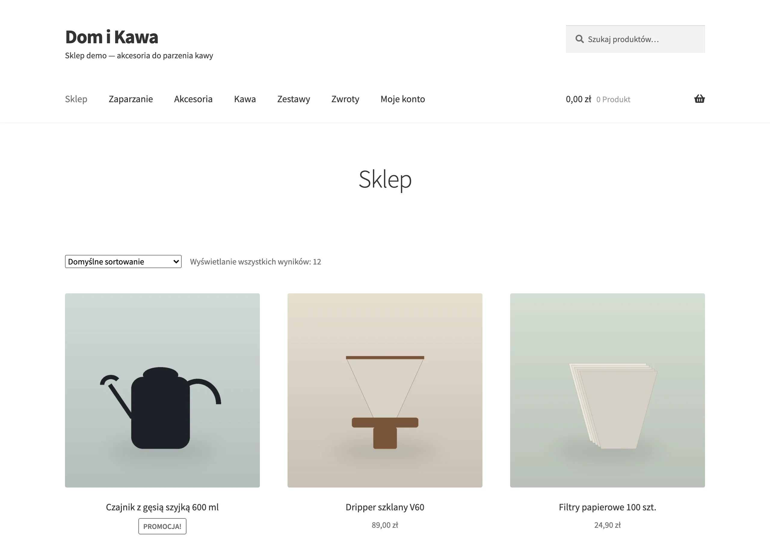
For a new user, what matters is a quick answer to two questions: what can I buy here and does this shop look credible. A returning customer wants shortcuts to categories, promotions, the account and the basket. A mobile user expects the same logic, but without scrolling through clutter. That is why the first screen should organise choice, not tell the company story.
From an SEO perspective, the homepage mainly handles branded and entry-level visits. It does not have to rank for every generic keyword if categories and product subpages do that better. In practice, that means less generic text and more clear links to priority sections. The faster the user finds the right direction, the better the whole shop architecture works.
What elements must be on the homepage?
Only elements that shorten the path to purchase or strengthen trust should be on the homepage. Every block should have a clear function: lead to the offer, help with choice, or confirm the shop’s credibility. If an element does not do one of these things, it usually takes up space and distracts attention.
In practice, the core of the homepage includes:
- a clear heading showing the scope of the offer
- visible main categories
- a well-exposed search bar
- one main promotional section
- short USPs covering delivery, returns, payments and fulfilment time
- trust signals such as contact, reviews and company details
- links to bestsellers, new arrivals or seasonal offers, if they make choosing easier
The most important things are the heading, categories and search bar, because they answer intent within the first few seconds. The promotional section should be one and should have a clear priority, otherwise promotions start competing with each other. It is best to place USPs and trust signals close to the offer, not only in the footer. This helps the new user assess the purchase conditions and transaction risk more quickly.
For returning users, easy access to the account and basket in the header also matters. Links to bestsellers, new arrivals or seasonal offers only make sense if they genuinely help with the decision. However, it is not worth turning the homepage into a wall of every category, brand and offer. A shorter set of blocks is better, but with a clear hierarchy and an easy path onwards.
On-page SEO: Key aspects for the homepage
On-page SEO for the homepage should above all clearly describe the shop and make it easier to move to important sections. The foundation is a unique title, meta description and a single logical H1 that do not try to cram in all the keywords at once. It is good if the title mentions the shop and the scope of the offer, while the meta description sets out the main benefits and navigation. This helps both the user and the search engine understand more quickly what the page is about.
On the page itself, a short introduction to the offer and the brand is enough, ideally placed close to the main categories. The point is not a long SEO block, but a few sentences that organise the context and strengthen credibility. On the homepage, short, specific content works better than an expanded text at the bottom that nobody reads.
HTML structure and internal linking are also very important. Sections should be semantic, and links to priority categories and guides should be available and described with consistent anchors. This way, the homepage strengthens the important areas of the shop instead of spreading signals across random subpages. A typical mistake is repeating the same links multiple times in several blocks, because it creates chaos without real benefit.
Decisions and trade-offs when designing the homepage
Designing the homepage requires choosing between product visibility, SEO, speed and simplicity of the journey. Most often, the layout that first leads to categories and search wins, and only then develops brand communication. If you try to show everything at once, the user gets more stimuli but fewer pointers. That usually reduces focus and makes it harder to move on to the next step.
Fewer blocks usually work better, because it is easier to build information hierarchy. Promotions are worth showing selectively, preferably in one main section with a clear goal. Several competing banners weaken the message and take visibility away from the categories that have the highest business priority. The homepage should support the category, not compete with it for the same attention and the same keywords.
The most sensible compromise is to keep the SEO copy short and the navigation decisions very specific. If you sell a broad range, it is better to highlight a few key entry points than the full map of the shop. Blocks with bestsellers, seasonal offers or guides only make sense if they shorten the choice or build trust. It is a mistake to add modules simply because there is room for them on the page.
What unnecessary elements can harm the homepage?
The elements that harm are those that slow the page down, distract from choice or duplicate the same paths without any real benefit. Most often these are rotating sliders, autoplay video and several promotional banners competing for attention. This layout makes decisions harder, because instead of one direction the user sees several competing messages. On mobile the problem grows, because the first screen turns into noise more quickly.
Long SEO texts at the bottom of the page, duplicate links and a wall of all categories or brands are unnecessary too. These blocks rarely help with choice, and often blur the priorities of internal linking. When the same category appears in several modules, chaos increases, not usability. If a block does not help the user get into the offer or assess the shop’s credibility, it usually just takes up space.
Aggressive entrance popups also do harm, especially when they cover the category, search bar or offer heading. They can reduce comfort, increase accidental closes and slow down the start of the visit. If a shop uses a popup, it should appear after a moment or after a specific user action. The priority remains moving on quickly, not forcing interaction straight away.
How to measure the effectiveness of the homepage?
The effectiveness of the homepage is measured by whether it leads the user to the next step. A long time on page alone says little, because it can also mean getting lost. What matters is moving to a category, search results, a product or the basket. That is why you need to look at behaviours that shorten the path to purchase.
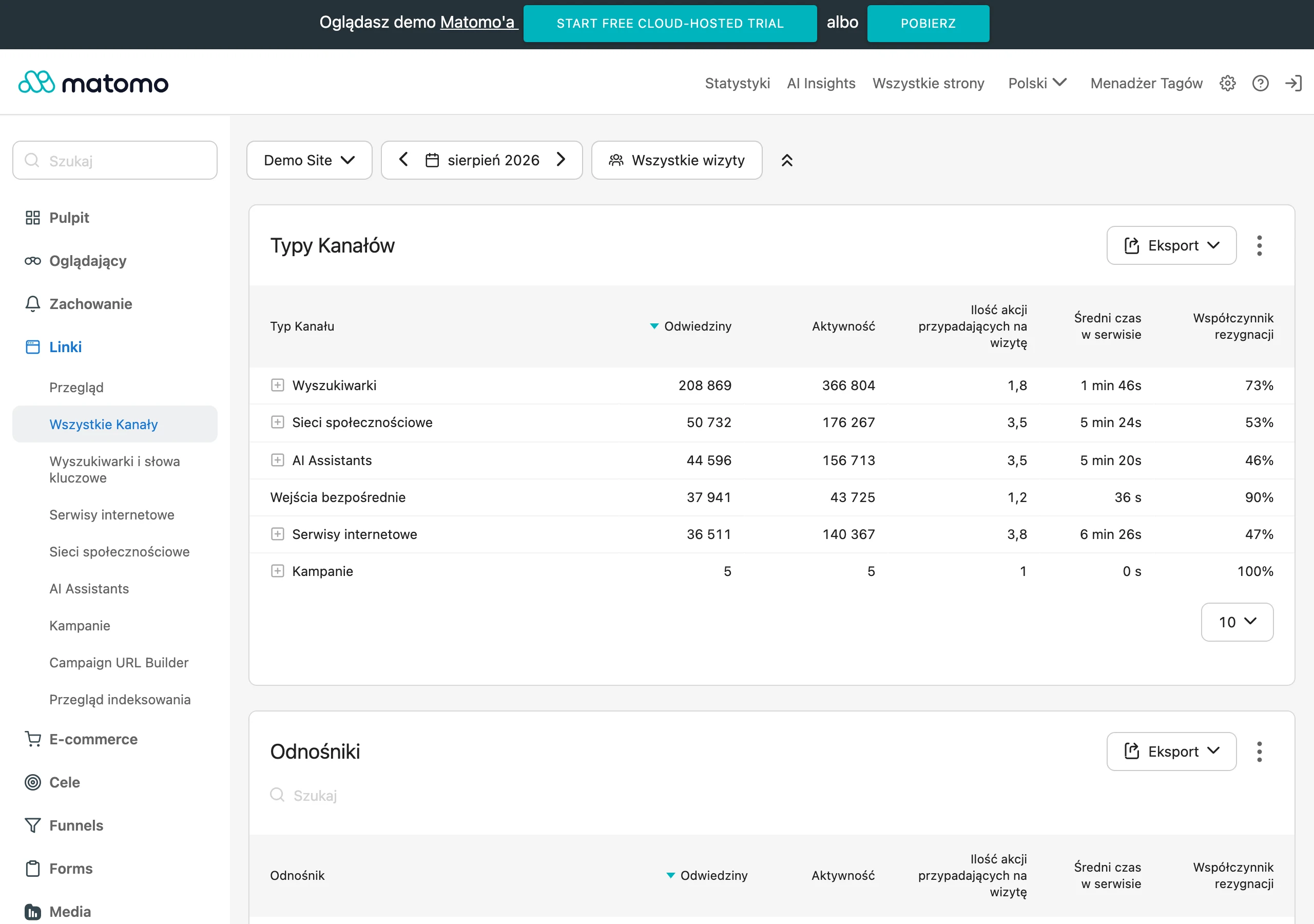
The most useful metrics show whether the homepage sends traffic to the right places:
- CTR to main categories and priority sections
- use of the search bar after entering the homepage
- sessions from the homepage ending with a visit to a category or product
- conversion rate for sessions starting on the homepage
- visibility for branded queries
If CTR to categories falls, the problem is often poor hierarchy or an overcrowded first screen. Low search usage may indicate poor exposure or, conversely, good category navigation. Metrics need to be read together, not separately. Only then can you see whether the user found a straightforward path or was just clicking around blindly.
It is also worth tracking Core Web Vitals alongside this, especially LCP and CLS, because technical performance affects every subsequent result. Scroll depth and click maps are also helpful. They show whether important blocks are visible and whether they actually draw attention. A good homepage does not keep the user on itself, but efficiently sends them to where decisions are made.
The most common mistakes and myths related to the homepage
The most common mistakes result from treating the homepage as a storage place for everything the shop wants to show at once. Then promotions, all categories, brands, company messages and several different click goals end up on one page. This layout does not increase usability, it only blurs priorities. The homepage works best when it selects the most important paths instead of trying to handle every possible intent.
A popular myth says that more banners mean a greater chance of sales. In practice, several competing messages weaken each one, because the user does not know what is really important. A slider on the first screen works the same way. It does not solve the communication problem if, from the outset, it is not clear what the shop sells and where to click next.
The second common myth is the belief that a long SEO text and a link to every subpage will improve the visibility of the homepage. In practice, this often makes the experience worse, burdens the layout and spreads internal linking across too many places. The homepage does not have to answer all queries, because that is what well-designed categories, products and advice content are for. It is more sensible to strengthen a few key sections than to pretend that one page will handle the whole shop.
FAQ
Frequently asked questions
What elements should be on an online store homepage?
Only elements that shorten the path to purchase or strengthen trust should be on the homepage. The most important are a clear heading, visible categories, search, one promotional section, USP and credibility signals.
Why shouldn’t an online store homepage show everything at once?
Because its job is to help the user move on, not keep them on one page. Too many blocks, banners and categories blur priorities and make choice harder.
Does an online store homepage need long SEO text?
No, a short and specific description of the offer and the brand placed close to the main categories works better. A long block at the bottom of the page usually weighs down the layout and has little value for the user.
What elements can harm an online store homepage?
Rotating sliders, autoplay video, several competing banners, duplicate links and aggressive entry pop-ups are the main issues. Such elements distract attention and make it harder to move to the offer.
How can you measure whether an online store homepage works well?
You need to check whether it leads the user to the next step, such as a category, the search, a product or the basket. Useful indicators include CTR to categories, search usage, product clicks and conversion from sessions that started on the homepage.
Should an online store homepage be the most important subpage for SEO?
It does not have to rank for every broad keyword if categories and product pages do a better job. Its SEO role is mainly to describe the store, organise the architecture and strengthen important sections with internal links.