


WebP is an image format that is most often implemented to make a website load faster without any noticeable drop in graphic quality. From an SEO perspective, what matters is not the file extension itself, but whether images stop being a heavy asset that slows down rendering of the view. WebP is not a direct ranking factor, but it can genuinely improve SEO results thanks to better performance, especially on mobile devices. In practice, the biggest gains can be seen with product photos, article thumbnails, banners and hero images. Converting files alone is often not enough if the graphics still have inappropriate dimensions or are not being served to the browser correctly. That is why it is better to treat WebP as part of the whole image optimisation process rather than as a one-off technical trick.
What WebP is in practice
WebP is an image format used on websites as a replacement mainly for JPEG and PNG. Its practical advantage lies in the fact that it often allows you to reduce file size while maintaining quality sufficient for typical on-page use. This matters especially where there are lots of graphics or where heavy images lengthen the time it takes to load the first view.
The format supports lossy and lossless compression, transparency and animations. As a result, it can replace several file types within a single standard, although that does not mean it will be the best choice for every asset in every case. For icons, simple illustrations and logos, SVG will still very often be better than WebP.
From an implementation perspective, WebP is not just about manually swapping a few images, but about preparing a coherent way of delivering graphics across the whole site. Most often this means converting existing files, generating several widths and hooking them up via srcset, the picture element, CMS functions or CDN rules. This way, a mobile user does not download a file prepared for a large monitor.
WebP delivers the greatest value where images are among the heaviest assets on the page. This applies especially to product photos, thumbnails on listings, images in posts and large graphics above the fold. If the largest image on the page affects LCP, optimising it usually matters more than mass conversion of small graphics.
From an SEO point of view, the benefit comes from performance, not from the format itself. A smaller image size can shorten load time, reduce data transfer and improve the user experience on mobile. This indirectly supports areas assessed by Google, but only when the implementation is technically correct and does not worsen the quality, layout or indexability of images.
How WebP implementation works
Implementing WebP comes down to identifying the images that weigh down the page the most, preparing the right variants for them and ensuring they are delivered to the browser correctly. This is a strictly technical task, not a one-off change of file extension. At the start, it is worth establishing which graphics really affect load time and the visibility of key elements on the site.
The first stage is analysis. You verify the largest images, assets above the fold and files that affect LCP and the rendering of the first screen. In practice, it is better not to change all graphics at once, because the greatest gains usually come from a few individual, heaviest images.
The second stage is classifying images by use case. Different compression settings work for photos, others for graphics with transparency, thumbnails, decorative elements and animations. This matters because automatic conversion with a single rule often ends in an average result: some files remain too heavy and some lose too much quality.
The third stage is conversion and preparing variants. Source images are used to generate WebP files in several widths so that the browser can download a version matched to the device and the place in the layout. WebP itself does not solve the problem if you still serve a 2000 px image where 600 px is enough on a phone.
The fourth stage is delivering files on the front end. This can be done through HTML, a CMS, a plugin, a framework or a CDN, but in every case you need to ensure correct addresses, MIME headers, cache and file versioning. In larger sites, this is usually where problems most often arise, such as duplicated assets, stale cached versions or incorrectly served formats.
The final stage is quality control and technical validation. You check image quality, compression artefacts, transparency behaviour, alignment with the layout, as well as the width and height attributes, layout stability and impact on loading speed. If after implementation a key image starts loading later because of inappropriate lazy loading or faulty CDN rules, the SEO effect may worsen despite the smaller file size.
The current context for WebP implementation
WebP is now a format that can be implemented on typical websites without much risk of compatibility issues. It is supported by modern browsers, popular CMSs, image processing libraries and most CDN networks. In practice, this means that technical support is no longer the challenge, and the focus shifts to the way files are prepared and served.
Performance analysis tools very often point to images as some of the heaviest assets on a page. For SEO, the file extension itself does not matter, only whether the image stops slowing down the loading of the key view. The most noticeable impact is seen where the graphic is visible immediately after entering the page, especially with elements that affect LCP.
Not every image file is worth converting to WebP. Icons, logos and simple vector illustrations are usually better left in SVG, because they weigh very little, scale without loss of quality and often look better than after being converted to raster. WebP is most effective where a site uses many photos or larger raster graphics.
It is also worth tying implementation into the whole publishing process. When the CMS, cache and CDN are configured carelessly, it is easy to end up with duplicate files, incorrect caching or serving outdated image versions after changes. A sensible WebP implementation is part of a well-organised pipeline, not a single plugin launched with one click.
What to implement and what to watch out for when using WebP
When using WebP, it’s best to start with the places where images genuinely slow down page loading, paying particular attention to quality, dimensions and delivery method. There’s no point starting with small icons or decorative elements if the biggest load is generated by a few large graphics above the fold. First improve what really affects speed and the user’s perception of the page.
- images in the hero section and large banners,
- product photos and galleries,
- thumbnails on category and article listings,
- images in blog posts that are placed high up on the page.
Keep source files in their original format, and treat WebP as the front-end delivery format. This makes it easier to re-compress, adjust quality and prepare further variants without losing control over the source material. If only the WebP version remains, later fixes can be more problematic.
Conversion on its own is not enough. In parallel, you need to set the correct image dimensions, prepare several widths for different screens and implement a mechanism such as srcset or picture so that the device downloads the right variant. If the image is still too large, WebP alone will not solve the performance problem.
Do not convert everything automatically without checking the result. In the case of some graphics, the file after conversion may end up larger or visually worse, especially with small text, sharp edges and unusual transparency. It is better to base the decision on a test of a specific image rather than assuming the newer format will always bring a benefit.
It is also worth making sure the key graphics load properly. The hero image or main product photo should not be delayed by misconfigured lazy loading, because then LCP can get worse despite the smaller file size. After implementation, also check whether the CMS or CDN is not generating unnecessary duplicates and whether the cache is being invalidated correctly after changes.
From an SEO perspective, make sure the full descriptive layer for images is in place. Sensible file names, the alt attribute, stable URL addresses and, where relevant, an image sitemap still help search engines understand the asset. WebP supports SEO through performance, but it does not replace the basic hygiene of image optimisation.
The impact of the WebP format on page performance
The WebP format improves page performance primarily because it usually makes it possible to reduce image weight without a noticeable loss of quality. A lighter file means less data to download, which translates into a shorter loading time on both desktop and mobile. This is most evident where graphics are large and appear immediately after entering the site.
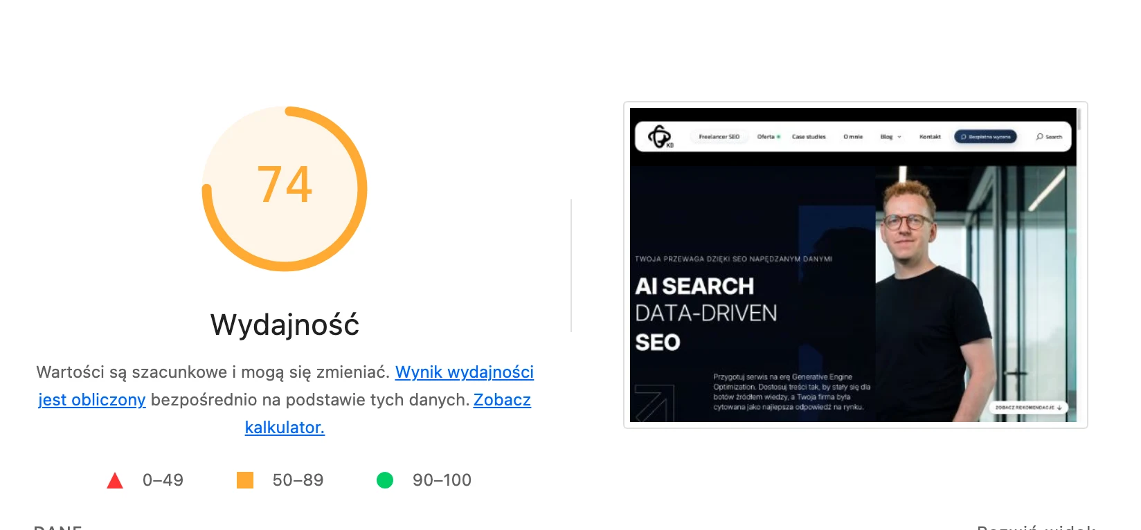
In practice, WebP works best for product photos, category images, article thumbnails and hero graphics. When such an image is the largest element in the view, its size directly affects LCP. Faster loading of a key graphic improves not only the user experience, but also the technical assessment of the page.
However, conversion to WebP on its own does not solve the issue. If the site still serves a 3000 px wide image on a phone screen, the benefit will remain limited. The best results come from combining WebP with responsive sizes, correctly configured srcset and proper placement of the image within the layout.
It is also worth being careful about implementation errors that can negate the gains. Overly aggressive compression reduces quality, and incorrect lazy loading can delay an element that is visible immediately after start. If an image affects LCP, it should not be automatically delayed just because it is “heavy”.
Performance is also affected by how files are delivered. Well-configured cache, CDN and correct MIME headers help you make the most of lighter images, whereas messy versioning can limit that benefit. For that reason, WebP should be treated as part of a broader asset optimisation process, not as a single format swap.
The strategic importance of WebP for SEO
WebP matters for SEO indirectly because it helps the site load faster and better meet performance requirements. Google does not reward the file extension itself, but it does assess user experience and the efficiency of the website. In this area, lighter images can genuinely support visibility.
The biggest impact is visible on pages where images are among the heaviest assets. This applies especially to e-commerce, content portals and sites with extensive listings. If graphics are slowing down the first view, WebP can be the solution where code optimisation alone no longer delivers major savings.
From an SEO perspective, what matters is not only speed, but also implementation stability. Images should have sensible URLs, correct alt attributes, consistent naming and predictable behaviour on the CMS and cache side. Changing the format must not break image indexing or cause uncontrolled multiplication of asset duplicates.
Strategically, WebP is best implemented where it delivers the greatest operational return. First the images in hero sections, then product photos, thumbnails and graphics in articles. The point is not to switch everything to WebP, but to reduce the load on the areas that have the strongest impact on speed and organic results.
It is worth bearing in mind that WebP is not a substitute for other SEO activities or technical work. It will not fix a weak server, a poor theme configuration, overloaded scripts or a badly structured front-end. It delivers the best results when it forms part of a bigger puzzle: optimisation of Core Web Vitals, responsive images, cache and correct content rendering on mobile devices.
Most common mistakes and limitations when implementing WebP
The most common mistake when implementing WebP is reducing the entire optimisation solely to file conversion. A smaller format alone will not help if the site still serves oversized images, does not use srcset or loads hero graphics with a delay. In practice, the key is the way the image is delivered, not just the file extension.
The problem is also often automatic conversion of all graphics without checking the result. Not every file will be lighter after conversion, and some images lose too much quality. WebP should be assessed at the level of a specific image, not rolled out without exceptions.
Another frequent mistake is using WebP where another format works better. Icons, logos and simple interface elements are usually better left in SVG, because they are lightweight and scale without loss of quality. WebP performs best for photos, thumbnails, banners and more complex raster graphics.
Implementations can also be derailed by technical issues on the CMS, cache and CDN side. The system may be able to generate many variants of the same image without control over naming, versioning and cache invalidation. This makes media management harder, complicates analysis and sometimes ends up serving outdated or unnecessary assets.
A limitation can also be incorrect embedding of images in the site code. When the width and height attributes are missing, the browser does not reserve space and the layout can shift while loading. Even well-compressed WebP will not improve a page’s score if images increase CLS or worsen LCP.
A very common mistake concerns lazy loading. Images below the first viewport are worth delaying, whereas the key image visible immediately after entering the site should not wait for scrolling or additional loading conditions. Poor lazy loading can cancel out the benefit of a smaller file.
Organisational limitations also need to be taken into account. If a company overwrites the originals and keeps only WebP files, later editing of the materials becomes more troublesome. It is safer to keep the source files separately and treat WebP as a delivery format for the front-end.
Finally, there is the SEO layer, which automation may be tempted to overlook. A format change will not replace sensible file names, alt attributes, stable URLs or the correct linking of images in sitemaps, if they are used. WebP supports SEO indirectly, but it will not fix problems with indexing, descriptions or the site architecture.
FAQ
Frequently asked questions
How does WebP affect a website’s SEO?
It affects it indirectly, because lighter images can shorten load time and improve page performance. This helps especially on mobile devices and wherever graphics slow down the first view.
Is converting images to WebP enough to improve performance?
No, because conversion alone will not solve the problem if the files still have the wrong dimensions or are not being served correctly. You also need to take care of responsive sizes, srcset, cache and correct placement in the layout.
When does WebP bring the biggest benefit on a website?
The biggest gains are seen with product photos, article thumbnails, banners and hero graphics. Images that affect LCP and appear immediately after landing on the page are especially important.
Is it worth converting all graphics to WebP?
No, because not every file will be better or lighter after conversion. Icons, logos and simple vector illustrations are often better left in SVG.
What needs to be done apart from converting files to WebP?
You need to prepare several image widths and deliver them to the browser via srcset, picture, CMS or CDN. Correct URLs, MIME headers, cache, versioning and quality control after implementation are also important.
Why should WebP not delay the key image on a website?
Because if the hero image or the main product image loads too late, it can worsen LCP. In that case, the gain from a smaller file is offset by poor loading configuration.